7 eCommerce design standards for your help page to improve customer loyalty.
Tháng 8 10, 2022
Design guidelines for your website support pages may not come to mind right away as you start setting up an online store. However, they are essential for retaining customers.
If your customer needs assistance after making a purchase, they want quick, uncomplicated responses to their inquiries. According to CEB, a research company that investigates best practices in customer loyalty, 67% of customers prefer self-service versus interacting with your employees.
Intuitive and straightforward self-service is vital for customer lifetime value, according to recent studies:
- Aspect found that 65% of consumers view a company favorably if they can solve an issue without calling customer service.
- Forrester ran a consumer survey about channel usage for customer service, reporting the use of the help pages and FAQ pages on a company website increased from 67% in 2012 to 76% in 2014.
- A 2017 analysis on customer service trends by Kayako, found that 90% of all consumers expect a brand or organization to offer self-service or frequently asked questions (FAQ) pages.
It’s obvious that ecommerce businesses need to deliver help pages to customers in the most effective way possible.
What steps can we take to simplify self-service so that it keeps customers satisfied and shortens the support line for our customer service teams? By researching what makes for truly excellent help pages and creating templates, themes, and layouts to be frictionless for the customer to browse.
To do that, we should incorporate these seven design standards into our help pages.
What is a help page design standard?
If you’re not familiar with what a design standard is, they’re simply a set of rules that web designers follow to align with visitors’ expectations. Design standards are guidelines for clarity and usability.
To give a clearer picture of what goes into a great example of a help page, we looked across the top 50 ecommerce retailers to find out how standard these standards really are. Using guidelines from a Nielsen Group article, we use the following thresholds:
- Standard: 80% or more of websites use the same design approach
- Convention: 50 – 79% of websites use the same design approach
- Confusion: 49% or fewer websites conform, no single design approach dominates.
Note: The sites included in this research are the top retail ecommerce sites in the “Shopping” category on Alexa.
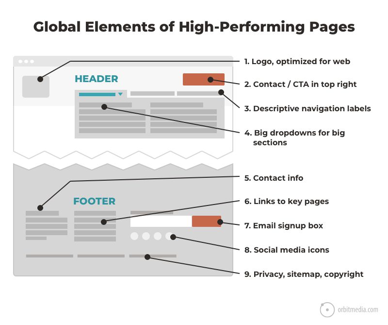
1. Well-placed search bar?
Only 38% of top retail ecommerce sites have a well placed search bar.

2. One-click links to frequent questions?
70% of retail businesses have easily accessible links to their frequent questions or FAQs.

3. Short titles with main keywords only?
96% of retail businesses have short help page titles – making short tiles with main keywords a design standard.

4. Clear categories or topics?
80% of retail businesses are giving clear categories and topics for their readers – this is just on the level of a standard.

5. Can a customer easily request further help?
90% of retail businesses make it easy to request further help. We considered a “contact us” button, an email address, or an icon for a live chat or messenger app as a way to request help.

6. Good use of white space?
Only 66% of retail ecommerce help pages are using white space in their formatting to help the reader’s eye. White space among retail ecommerce stores is a convention and not a standard.

7. Minimal navigation options?
Only 24% of help pages offer navigation options that aren’t too overwhelming for customers.

Let’s review our design standards…
Not all design standards are standard. Three out of seven retail ecommerce help pages met criteria for design standards. Of the four remaining design standards, these fell into two conventions and two confusions.
Let’s look at why these design standards matter and some examples of websites that use them well, and not so well.
1. A well-placed search box or bar
Having a search bar is a design best practice, it helps your customers easily navigate to relevant help pages.
A help page without a search bar means your customer has to click and navigate their way around, read plenty of lists and hopefully stumble across the right page. This makes for a really high effort and frustrating customer experience.
Good example: This search bar catches your attention as soon as you hit their help page.

Bad example: This help page forces customers to click around to get their answer.

2. One click-links to FAQ
Having a great FAQ page can reduce the amount of inbound support request you receive.
Deflecting requests for help away from your support team is the goal of all help pages.
Your support teams are already understaffed and have a big support queue to deal with. Having a clear section to give customers quick help is essential, especially for delivery related questions (last mile delivery is tricky!) If you don’t, it results in frustrated customers and angry emails for your support team to handle.
Good example: This page caters to common problems, and directs customers straight to the FAQ section.

Bad example: By other design standards this help page is ideal, but it needs a devoted section of 5-6 FAQs if they want to help customers faster.

3. Short titles with main keywords only
Similar to how people Google search in “caveman English”, expect help page browsing to be the same.
According to CoSchedule, a tool that helps you write better headlines, when skimming content most readers tend to read the first and last three words of a headline.
If you’re looking at giving customers information on your ecommerce store’s return shipping costs, a headline like “Return Shipping Costs: What Charges to Expect” is going to work a lot better for content scanning than “What Is the Price of Return Shipping to Company A?”
Good example: Address the problem in the least amount of words to help customers scan titles quickly.

Bad example: Not offering help pages is bad enough, but making the focal point of your knowledge base to increase revenue is even worse.

4. Clear categories or topics
Icons or at least organized text is a great way to communicate and display the categories or topics where your customer might need help. Customers don’t want to spend a lot of time trying to help themselves. They want to get in, grab their answer and go.
Good example: These clear categories give customers the best chance of self-service success.

Bad example: A list is better than nothing, but putting that information in a table would create effortless browsing.

5. Can a customer easily request further help?
There may come a time when a customer’s need is too complicated for one help page. This is why having a phone number, email address, contact button or live chat option is essential to helping customers get their solution with the least amount of effort.
Offer the channel where you can provide the best help as quick as possible. If you don’t man the phone, don’t list a phone number. List an email address instead.
Good example: Sets clear expectations of availability and offer multiple channels where the customer can achieve help.

Bad example: Typically you’d expect an email address or contact form right at the bottom of the page, but neither of those are listed. There’s a telephone number, but what’s it for – sales or customer service? Let the customer know!

6. Use of white space
White space is an essential part of readability on your help pages. If they’re not structured clearly and readers are not able to scan pages easily, expect a lot of support requests because they just won’t be bothered to look over a poorly designed page.
Along with headings, subheadings and bullet points, images and videos add a better dynamic to your help pages but also help break up large pieces of text.
Good example: Personal introduction offering many ways to self-serve that the eye can easily navigate.

Bad example: This help page is too crowded. It takes a lot of work to find the option you’re looking for.

7. Minimal navigation options
Your customers are there to help themselves not to browse more products. Be empathetic to your customer’s needs and keep your navigation relevant to what they might struggle with, instead of trying to upsell them.
Good example: A great example of helping a customer get the kind of support they need right off the bat.

Bad example: Will the navigation along the top help you get specialized help with a watch or will you be looking at the online catalog for new watches? Keep navigation relevant to getting answers more easily and more quickly.

How did we get a list of seven design standards?
There’s a lot to analyze in design standards. While compiling this list we had to be careful that we weren’t crossing over into what goes into web design standards of a homepage.
What we did was use the research at the top of this article, empathize with the customer and put ourselves in their shoes. Then we simply asked ourselves, what would a help page look like if it provide a frictionless customer experience?
We also looked outside of the area of retail and at bigger businesses that showcase excellent design examples of knowledge bases and help pages.
Look how easy both of these help pages from Netflix and Lynda make it easy for customers to get in and get out with an answer, just like the customer wants:


Why might a site not conform to design standards?
Retail ecommerce businesses might have specific design requirements and needs which draw them away from adhering to design standards. Some of those reasons could be due to brand standards, coding standards, and accessibility standards.
But with the risk of breaking web conventions, you also break the user experience of your website.
Results from a Nielsen Group survey on Bucknell University’s website redesign on how it broke away from some long-established conventions reported that prospective students and users of the site found it increasingly hard to find the relevant information.
Although the website redesign sparked a lot of social and blog attention, both good and bad feedback from critics, the site actually ruined its user experience with several participants struggling to find:
- A list of majors that the school offered
- The cost of tuition
- If the university offered their program of choice
In moving away from web design standards, Bucknell University actually ruined its prospective business by hiding core information behind a fancy design.
Design of your help page matters
Whether you’re searching the web for a help page template, theme or layout, there are design requirements you should consider when you build a help page to give your customers easy self-service.
Understand that the design of your help page dramatically effects the amount of effort a customer has to put into finding the correct bit of information to help themselves to a solution. You want to present this information in the most intuitive way possible and make it easy for all of your customers to find a solution.
While no web conventions strictly exist for a help page, it can be agreed that arranging your information in the most effective way through clear topics or categories, using smart titles for your articles and always providing the option for your customer to seek further help is a best practice when it comes to building a great help page.
Article by Adam Rogers of Kayako