Explain content marketing with these 55 marketing diagrams and charts
Tháng 8 14, 2022
When concepts get tough, content gets visual. Marketing diagrams are a fast way to explain complicated topics and tricky ideas. Nothing makes a muddy post clear like a good visual.
So for this post, we’re stacking up the best charts and diagrams from 10+ years of articles.
Here are 55 diagrams and charts that explain tough marketing concepts fast. We’ve organized them into four big concepts:
As you scan through, think about your own content and keep this in mind.
You may use any of these diagrams in your marketing
Would any of these diagrams improve an article you’re working on?
Feel free to use them. Please just cite the source and link to the original location of the image.
Need a quote to support the image?
I am happy to provide a quick contribution. Just drop us a line with a quick request.
Content Marketing Diagrams
The diagrams and charts in this section make content marketing concepts visual. Some are research, some are flow charts, others are simple tables that compare and contrast ideas.
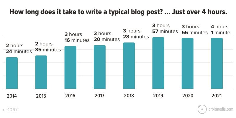
1. How long does it take to write a blog post?
This is one of many charts from our annual blogger survey. It shows the average investment of time in a single piece of content:
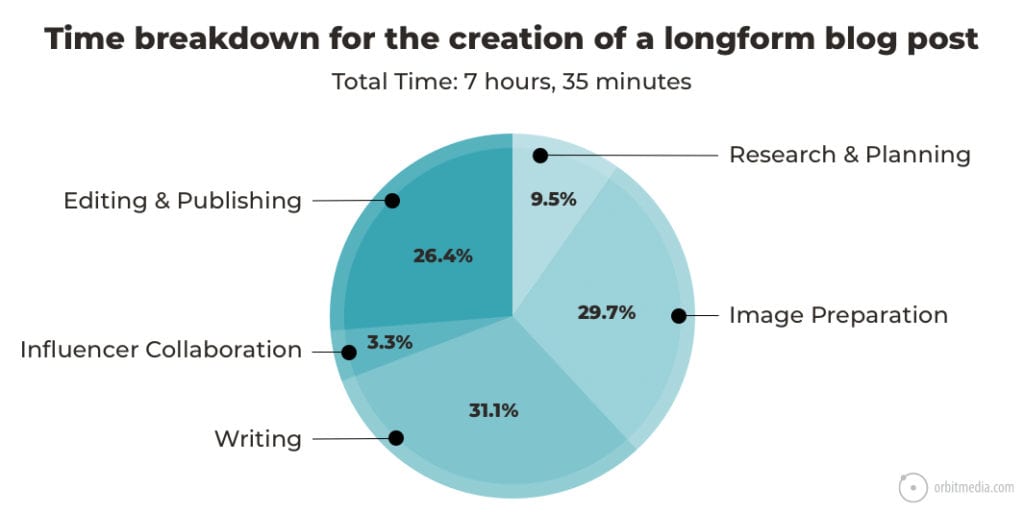
2. Time required to create a long-form search optimized article
This is a more specific look at the same question. It shows how much time goes into which categories for a single piece of content for this blog.
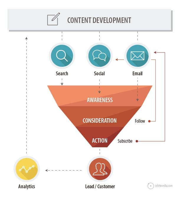
3. Content promotion channels and the funnel
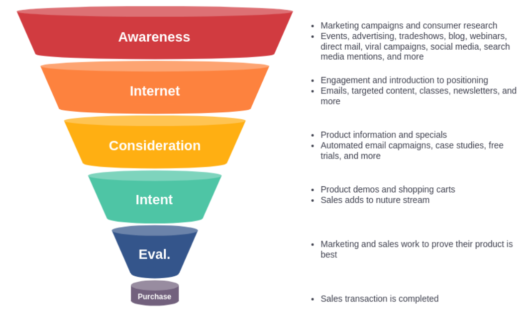
Ultimately, content marketers do three things: create content, promote it and then measure results. Here is a top-view look at the funnel, showing how the three different promotion channels affect the funnel in different ways.
Search = Awareness
Google is a discovery engine. High rankings for a relevant phrase can have a dramatic impact on awareness.
Social media = Awareness and consideration
Social media also increases awareness, since it makes you visible to friends of friends. When they interact with the content, it indicates stronger connection and consideration.
Email marketing = Consideration
Email signup requires a higher level of trust. But when they subscribe, you can reach them consistently. You’ve moved beyond simple awareness and toward greater consideration and action.
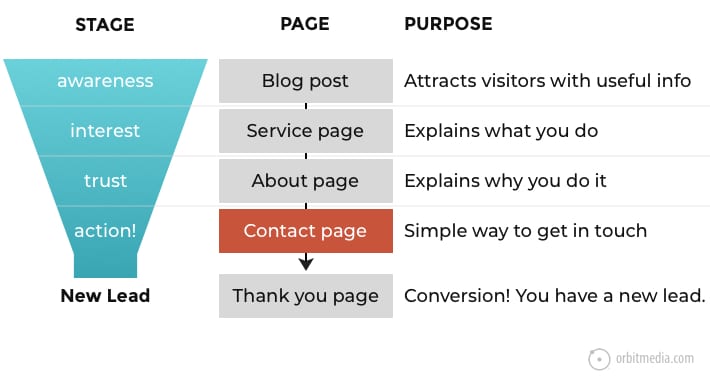
4. How content aligns with website pages
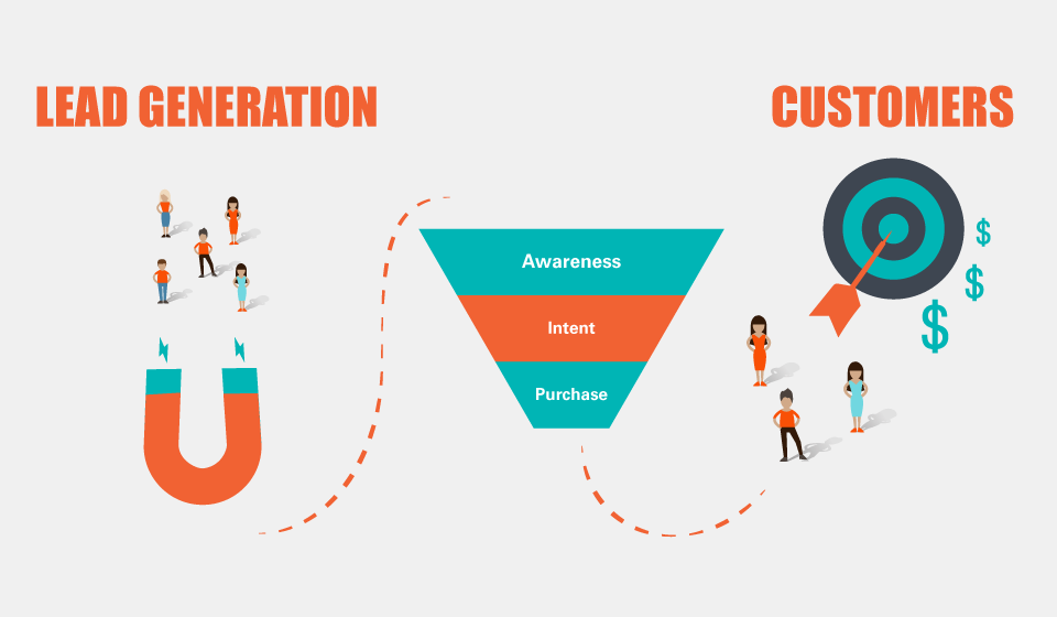
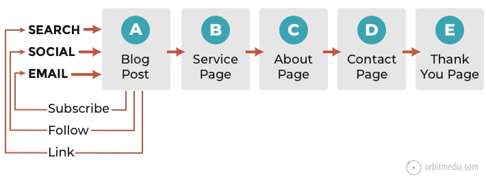
Funnel stages can also be aligned with pages on a website. Here in one diagram, you can see which pages on a site align with the psychology of visitors on their path toward conversion.
5. The virtuous cycle of blog traffic …and eventual demand
Regardless of the traffic source, some visitors may subscribe, follow and link, which then helps power the next visit through email, social and search.
Eventually, a small percentage of visitors move through to the rest of the pages and a lead is born.
6. Website traffic sources
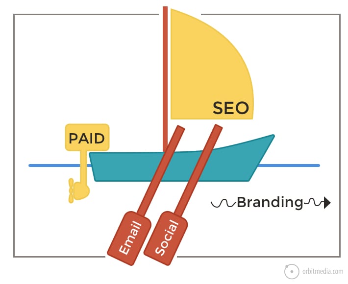
Traffic flows into websites through channels. Some require money (paid advertising) while others require time (content marketing). Some require ongoing activity (email and social) but SEO becomes a durable source of traffic over time. Together, they are the oars, sails and motors.
And of course, famous brands drive tons of direct traffic.
7. Two types of offerings: transactional and consultative
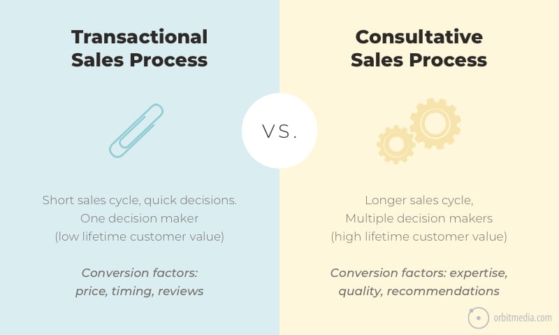
They require two different types of marketing. Understanding the difference unlocks quick insights into the types of content and calls to action that will work for any brand.
8. The Periodic Table of Content
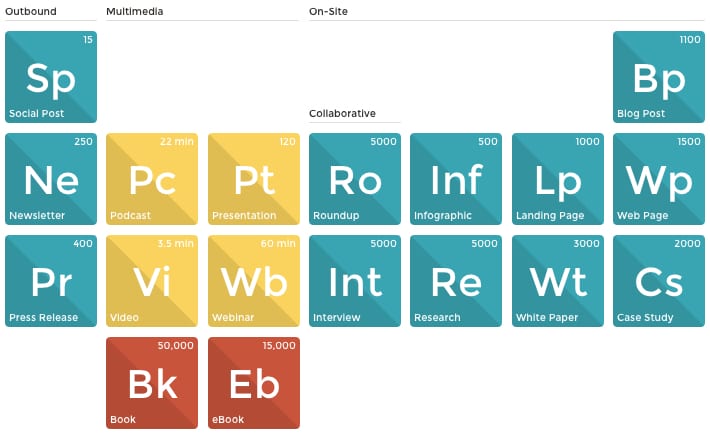
There are so many different content formats in digital marketing. Repurposing content is about moving the material from one format into another. This little chart shows all of the possible formats and triggers repurposing ideas.
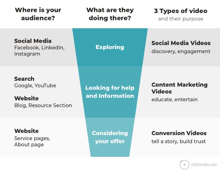
9. The three types of marketing videos
Speaking of formats, video is one of the most powerful and versatile. Videos have different outcomes, depending on where they are and who views them. There are really three types of videos, each aligned with a different stage in the funnel. This little chart explains.
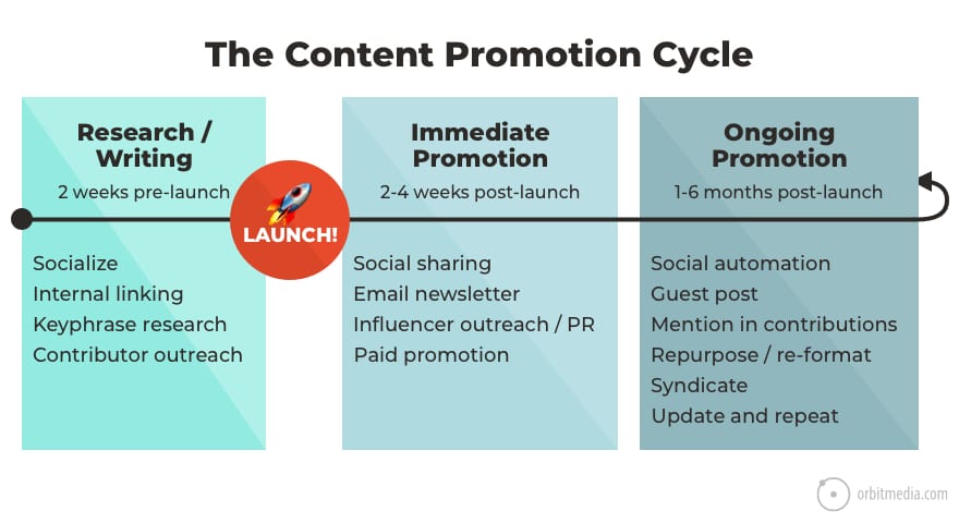
10. The content marketing promotion cycle
Regardless of the format, success of a piece of content depends on how well it’s promoted. The best content doesn’t win, the best promoted content wins.
This diagram shows the cycle of promotion, which starts with research, before the content goes live.
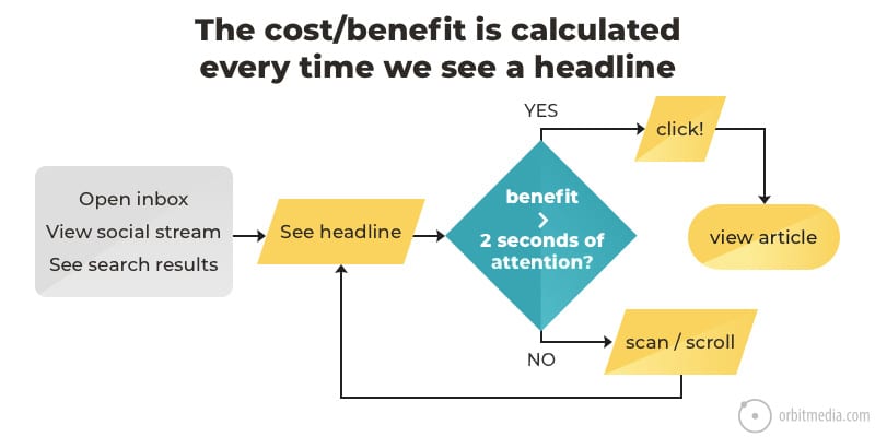
11. What happens when a potential visitor sees your headline?
With a great headline, promotion is easy. With a bad (or boring) headline, promotion is almost impossible. The key is to understand that the reader of the headline does a split-second cost benefit analysis before they decide to click. This chart explains.
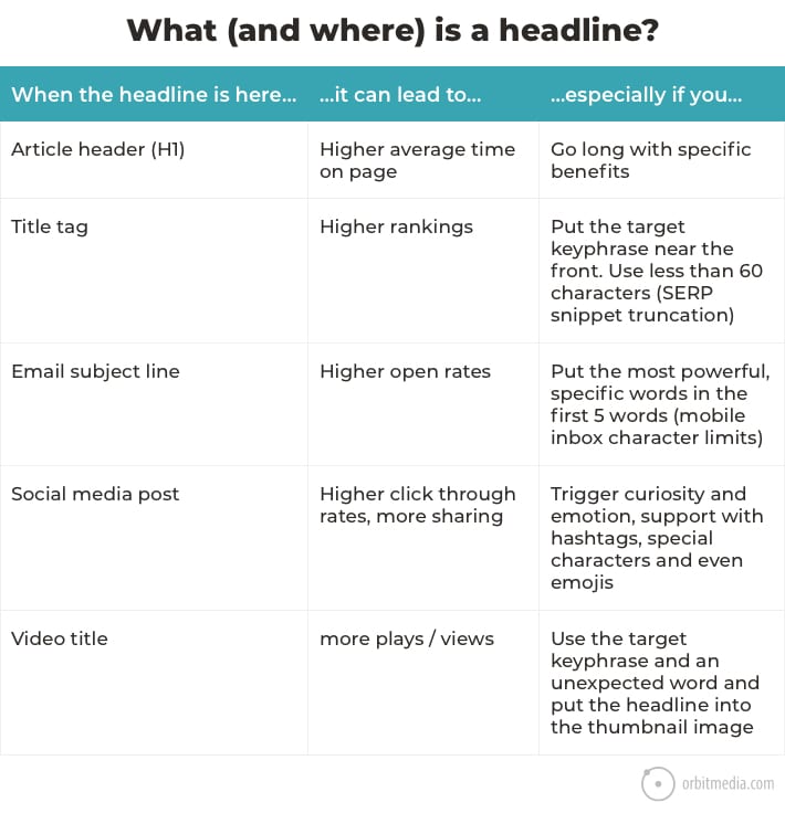
12. What and where is a headline in digital marketing?
Actually a headline isn’t one thing. It’s different things in different places. In email it’s a subject line. In search it’s a title tag. On the page is an H1 header.
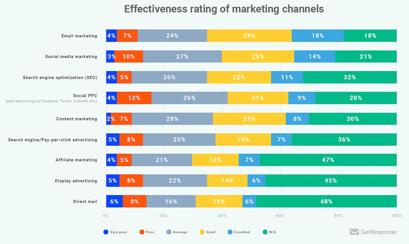
The “headline” can be aligned with the opportunities of the location, depending on where it appears. This chart shows the various locations and success factors of each.
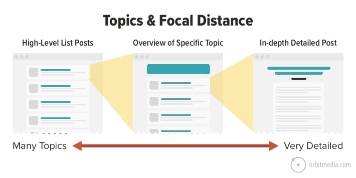
13. Topics and focal distance
Zoom in or pan out. Cover the topic in detail with a long-form search-friendly post. Or stay high-level and cover a range of related items. Every topic in the universe can be organized on a fractal. You can find great ideas at any focal distance.
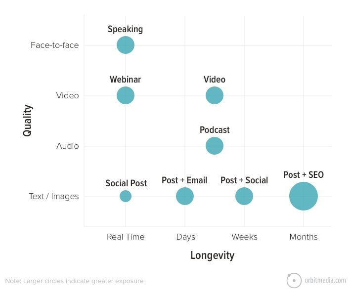
14. Content quality and longevity
Some content makes a strong impact. Other content lasts a long time. Unfortunately, they’re usually not the same piece.
- Content quality
Face-to-face interaction is ideal, forming the strongest connections and building the greatest trust. Text is sadly the weakest format at conveying tone and nuance. - Content longevity
Some last just for that moment, passing in real-time. Social posts are visible for hours or days. Search optimized articles may be visible for months or years.
This chart shows the quality and longevity of various types of content:
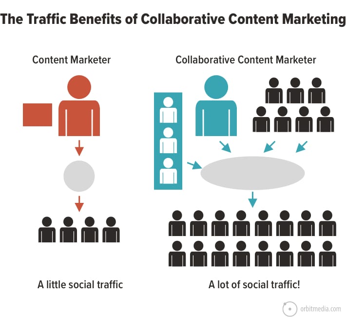
15. Solo, lonely blogger vs collaborative marketer
Before we called it “organic influencer marketing” we just called it content collaboration. The idea is to include others in your content, through contributor quotes, roundups and interviews. It improves the quality of the content, but also the traffic.
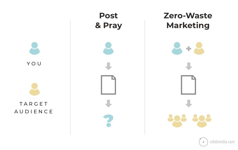
16. Post and pray vs Zero waste marketing
Even better than including influencers is including your audience. When you involve your actual prospects in the process of content creation (interviews, contributor quotes), the post is guaranteed to reach its target. This is known as zero-waste marketing.
Social Media and Influencer Marketing Diagrams
The charts in this section explain some of the biggest (and trickiest) concepts in social media. Some are obvious, others might seem new.
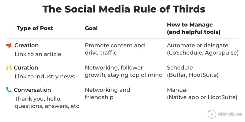
17. The social media “Rule of Thirds”
There are definitely three kinds of social media posts. They are never equal thirds in a social stream, but all great social accounts include all three:
- Creation: Posts with links promoting articles created by the brand
- Curation: Posts with links to news and articles from friends
- Conversation: Personal messages of thanks, hello, questions, answers and congratulations.
This chart shows the goals and the tools for each.
18. The five types of influencers
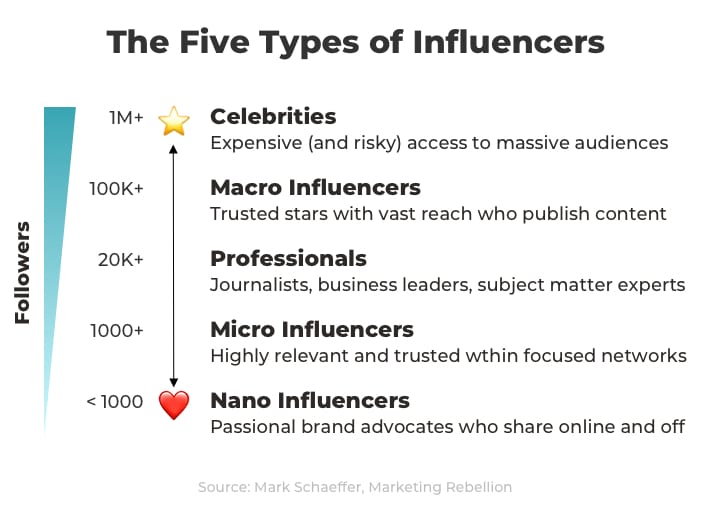
This chart is taken from a page in Mark Schaefer’s Marketing Rebellion.
Mark didn’t use the term “Nano Influencers.” There’s some debate on the use of that term. The idea is that you can find influencers at all levels, and that anyone can be an advocate within their own networks.
19. Influencer marketing strategy: formats and outcomes
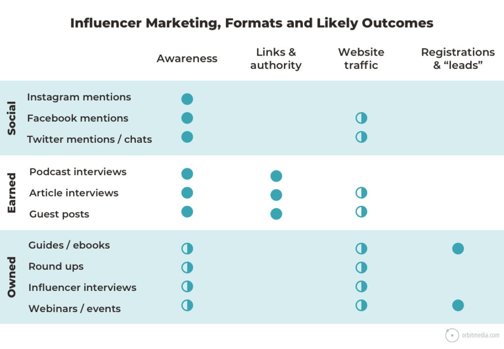
Which influencers and which channels determine the outcome of the program. Some collaborations lead to traffic, others do not. Some can drive registrations and leads, most don’t.
This chart shows at a glance how different channels and formats support different marketing goals.
20. How influencers affect search engine rankings
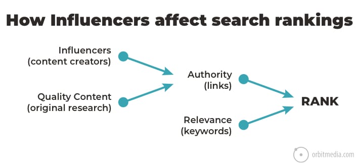
The “Links & authority” column in the chart above is an SEO thing. The ranking potential of web pages is partly a function of the links to that website and webpage. This is often called Domain Authority (more on that topic here).
Influencers are critical to growing Domain Authority. Bloggers and editors create content, content often includes links. This chart shows how influencers, when combined with link-worthy content, lead to rankings.
21. Costs for paid influencer marketing
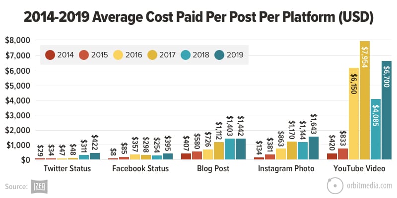
The cost for mentions and endorsements from influencers varies across platforms. And it’s gone up over time. Izea is an influencer marketing agency that has tracked these things since 2014.
This chart shows the costs of paid posts on Twitter, Facebook, blogs, Instagram and YouTube.
22. Should you add that social media icon to your site?
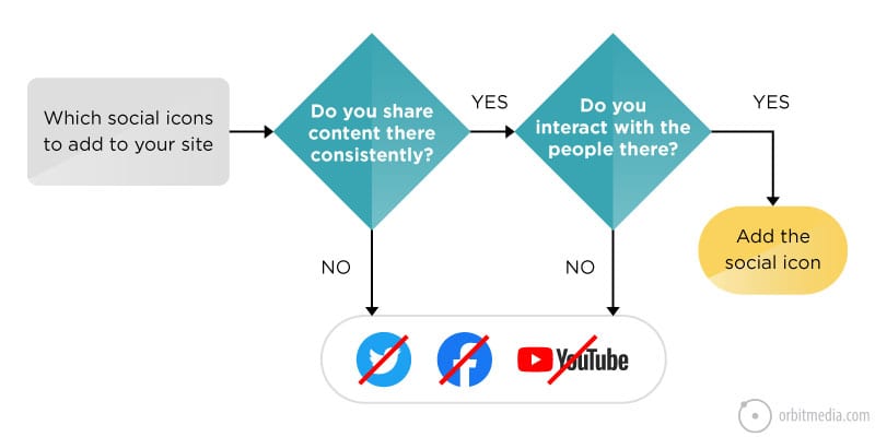
It should be obvious, but it’s not. Websites link to dead social accounts all the time. More common is for a website to include social icons to a social network where they drop links, but don’t listen or interact.
This simple diagram makes an important point: a site should only promote social networks when two criteria are met: they share content there consistently and they interact within that community.
23. Profile picture best practices
Do a friend a favor and share this post and diagram. It’s a simple tip for the composition in headshot photography that will help them look more professional. A quick tour through LinkedIn shows just how many accounts seem to miss this basic idea.

Search Engine Optimization Diagrams
This set of visuals all relate to SEO. There are a lot of deep concepts related to search. It would be impossible to teach this topic without visuals. There are some of the most useful we’ve created:
24. The three types of keyphrases
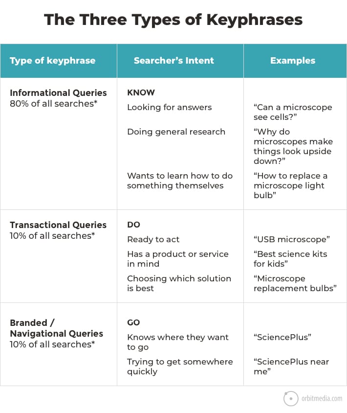
Every keyphrase indicates intent. And the strength of that intent varies widely. As searchers we are problem aware, some are solution aware, some are brand aware. In these moments we search for different phrases: KNOW, DO and GO.
25. The two main search ranking factors
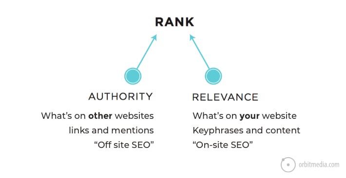
If you need to explain SEO in ten seconds with one visual, this might be it. The two most important search ranking factors (and types of SEO) are authority and relevance. Of course, there’s more to it, but this is 90% of the game.
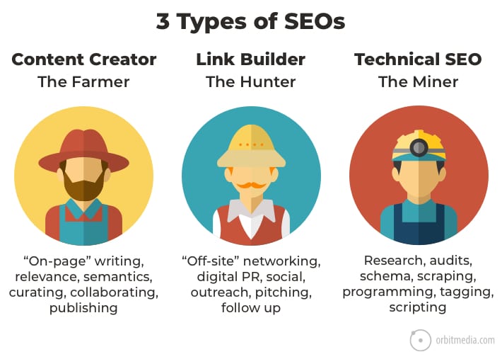
26. The three types of SEOs
Just as there are different search ranking factors, there are different types of SEOs.
- Content creators focus on on-page SEO
- Link builders focus on off-site SEO
- Technical SEOs are concerned with the crawlability, schema, site structure, etc.
It may be helpful to think of them as farmers, hunters and miners. Virtually every SEO specializes in one of these three aspects.
27. Link reclamation flowchart
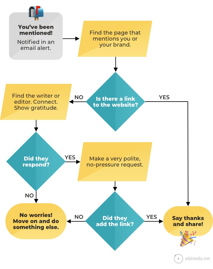
You don’t have to be a full-time link builder to capture those quick wins. It’s simply a matter of listening and outreach. The listening involves brand alert tools. The outreach is just a simple request to turn that mention into a link.
All the best SEOs follow this basic flowchart. It’s called link reclamation and it’s a close cousin to PR.
28. Three criteria for selecting keyphrases
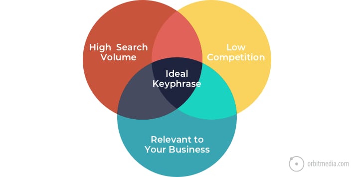
It’s not helpful to target a phrase if no one is searching for it. It’s also not helpful to target a phrase that you have no chance of ranking for. There are really three criteria for selecting keyphrases. This Venn diagram makes that clear at a glance.
29. The Domain Authority power curve
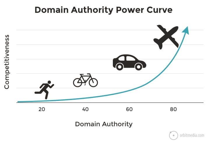
This is also about keyphrases and competition. Don’t enter a race if you have no chance of winning. More credible websites have exponentially more authority and have a chance of ranking for more competitive phrases.
The trick to winning is to know your own level of authority and then target keyphrases accordingly. This chart explains one of the most important, but least understood aspects of digital marketing.
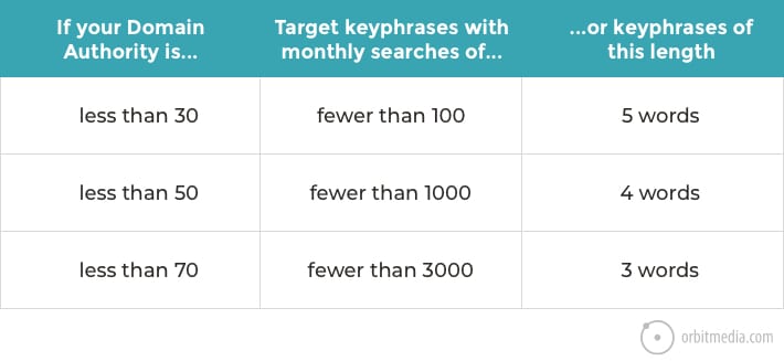
30. Domain Authority and keyphrase length
There’s a shortcut in keyphrase research that can help anyone focus on the realistic phrases quickly. It’s to first understand that longer, more specific phrases are less popular, but also far less competitive. That means that you can often win with a lower domain authority just by targeting longer keyphrases.
31. What’s that link worth?
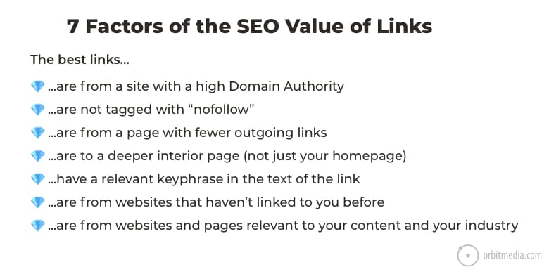
Not all links are created equal. Smart SEOs and link building agencies understand link equity. They can estimate the value of a link (actual or potential) very quickly. It’s a skill that requires a complete view of both the source and the target.
Here are seven factors that determine the SEO value of every link on the internet.
32. The Control + F Test (finding instances of keyphrases
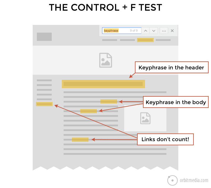
If a page has sufficient authority, but still isn’t ranking, it’s usually a problem of relevance. In other words, the page isn’t sufficiently focused on the phrase.
By simply using the “find” feature of the browser, you can quickly see if a page uses any phrase, and if so, where. We do this all the time during conversations about content and search. It often shows content gaps in seconds.
33. User interaction signals and rankings: Short vs. long clicks
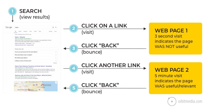
Beyond authority and relevance, there is another important search ranking factor: what visitors do after they click on a search result.
- If they quickly hit the back button, Google may see that as a signal of low quality content.
- If they stay for several long minutes before hitting the back button, that suggests to the search engine that the page is good.
This is often referred to as the short or long click, also known as low or high dwell time. This chart makes that concept visual:
34. The biggest trend in SEO
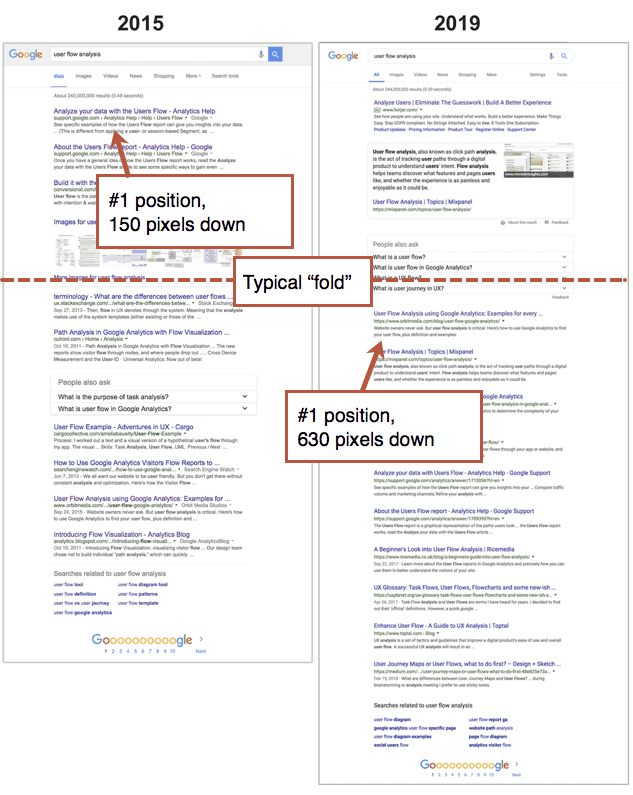
Finally, the big picture. A lot of marketers are worried about their rankings. But rankings aren’t everything. It’s really the rankings AND the click through rate that determine traffic. And click through rates have been on a steady decline for years.
Why? Because organic search rankings have been pushed down by SERP features (images, maps, videos, products, people also ask boxes) reducing the likelihood that a searcher will even see a high ranking page.
Take a look at a side-by-side comparison for a single keyphrase over many years. The difference is dramatic.
Email Marketing Diagrams
Email is such a powerful and important channel. Once a visitor subscribes, they’ve given you permission to connect with them directly. No more giant tech company (Facebook, Google, Twitter) in the middle.
But email marketers often miss the little things that make a big difference.
Here are a few diagrams that explain these quick hits fast.
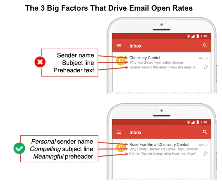
35. The three main factors in email open rates
There’s the sender name, the subject line and the preheader text. These are the main factors in the open rates for email, aside from timing and deliverability.
Improving these three elements cost no money and takes very little time. Still, lots of email marketers fail at the basics. Compare the difference:
36. Optimizing email subject lines for the mobile inbox
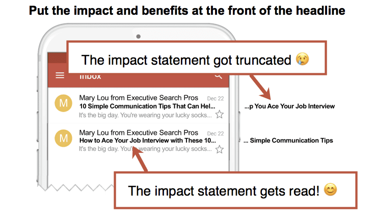
Here’s another simple trick. The mobile inbox may truncate subject lines after as few as 45 characters. With this in mind, make sure to include the most compelling or emotional words at the beginning of the subject line, in the first five words.
If the recipient doesn’t see the benefits, they’re unlikely to tap to open.
37. Email signup calls to action
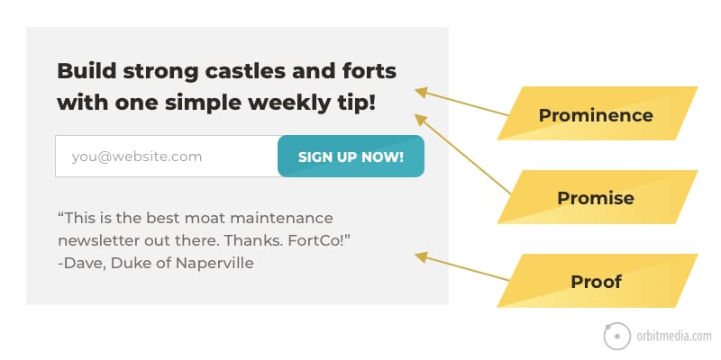
The battle to win or lose your next subscriber is fought in the sign up box. If you email signup box includes the three P’s, you’re likely to much higher conversion rates and faster list growth.
- Prominence
The signup form is clearly visible (top of the blog, sticky footer, popup window) - Promise
It indicates the topic of the newsletter and gives them a reason to subscribe. It says more than “sign up for updates” - Proof
There’s evidence that others have taken this action before. That could mean the size of a list or a mini-testimonial of a happy subscriber.
The diagram shows a signup box with all three P’s.
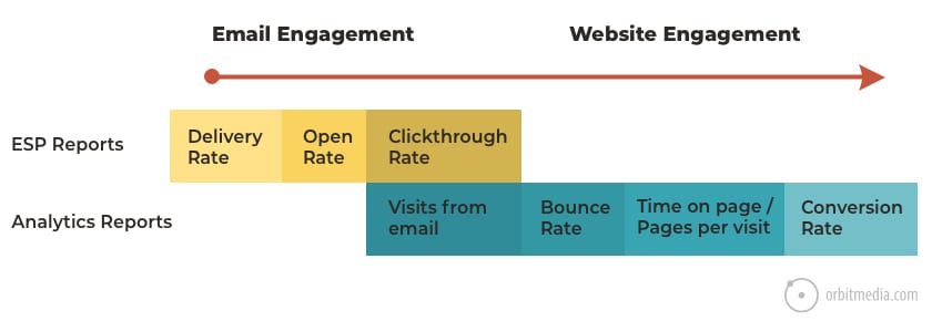
38. Email engagement vs website engagement
The analytics in your ESP (email service provider) only go so far. To connect the dots to website traffic, you’ll need to add campaign tracking code using a URL builder.
Once the tracking codes are in place, you’ll be able to see the post-click date (traffic, engagement and conversion metrics) from that email. Very handy.
Web Design and UX Diagrams
These diagrams explain some of the most important web design and usability concepts, including conversion, which is the ultimate goal in digital marketing.
39. The psychology of conversion
The percentage of visitors who take action on a website is called the conversion rate. There are a lot of factors. Ultimately, the visitor’s motivation must be greater than the friction.
This chart shows those opposing forces, clarity and confusion, and the goal of the website.

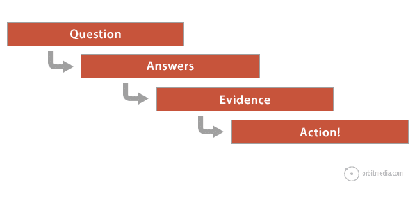
40. Guiding visitors from answers to action
Getting the visitor to that goal requires that you first know their information needs (questions) and that you satisfy them by meeting their expectations (answers).
Next the page needs to give them reasons to believe those answers (evidence) without which the page is just a pile of unsupported marketing claims. Finally, give a clear path to conversion (action)
Here is that framework in one handy chart.
41. Homepage design: quick communication with descriptive labels
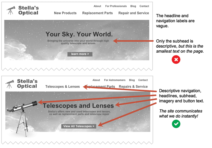
Every visit to every page starts with the same question: am I in the right place?
Some home pages answer that question fast. Others do not.
This little comparison chart shows some of the ways in which homepage design can be clear or confusing. Spot the differences? They impact both search rankings and visitor engagement.
42. Service page design: the 13-point checklist
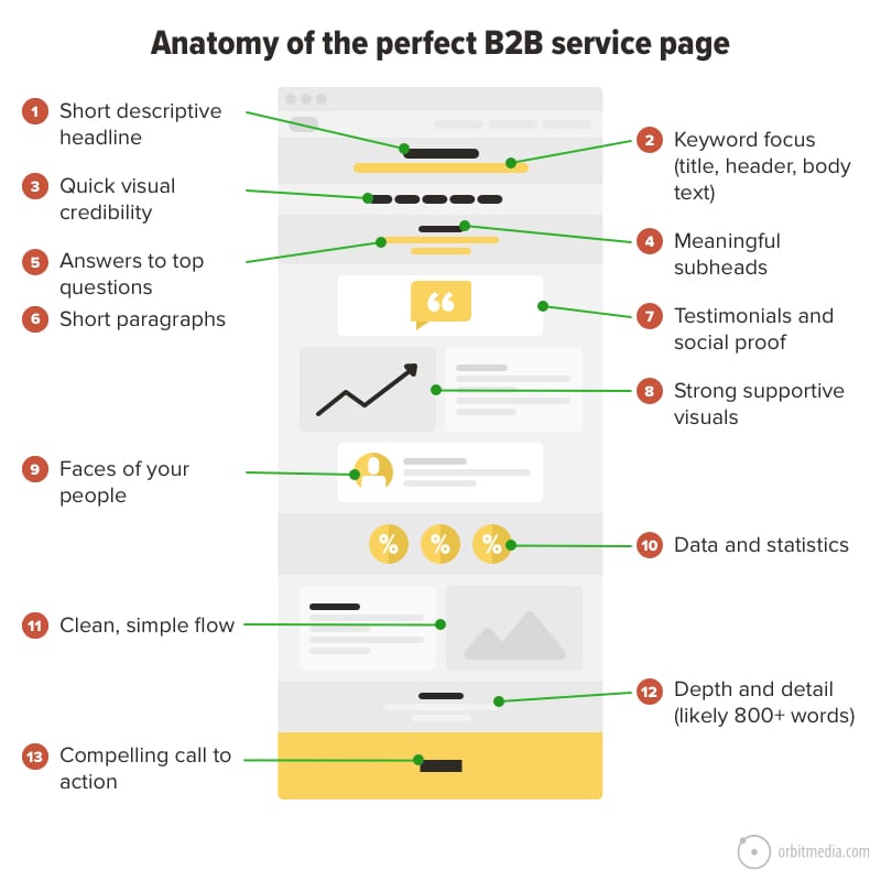
Once they’ve clicked deeper and landed on a service page, it’s time to sell. The best service pages emulate a sales conversation. They use answers, evidence and calls to action, but there’s more to it. Does the page show the people? Is it optimized to rank? Are the visuals supportive or stocky?
Here’s an entire checklist for service pages in one diagram.
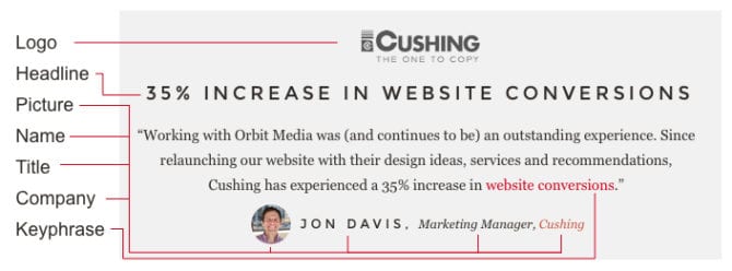
43. The anatomy of a great testimonial
The testimonial is great effective supportive evidence for any marketing message. But there are a lot of ways to use them, some good, some not as good.
After 20 years of building websites, here’s what we’ve learned. Testimonials that include logos, headlines and pictures are more compelling. As a bonus, look for testimonials that include keywords. Good for SEO!
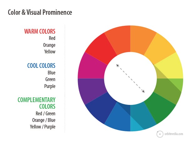
44. Color and visual prominence
Every page has a visual hierarchy, whether it was intentionally designed or not. And color is one powerful way to guide the eyes through a page. Visual contrast is visual prominence. Colors on the opposite sides of the color wheel (known as complementary colors) have the strongest contrast.
Designers can leverage this contrast to draw attention to key messages or calls to action.
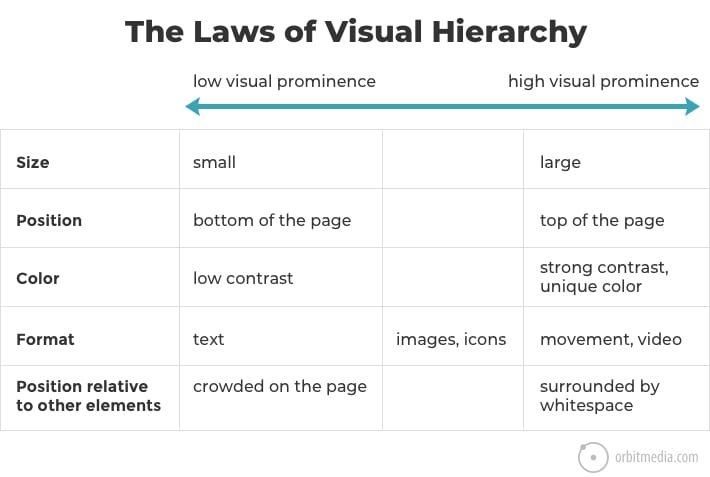
45. The laws of visual hierarchy
Beyond color, there are other factors that determine where the visitor looks. Position, size, whitespace and movement are all opportunities to align the prominence of elements with the priority of messages.
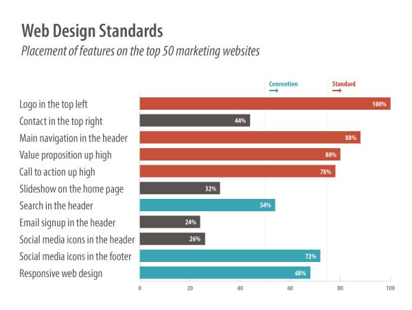
46. Web design standards
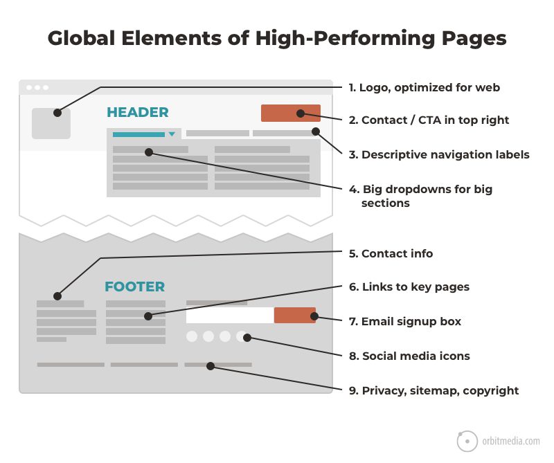
Which features are standard on websites? Which are just common conventions? A little research revealed the elements that are most and least common, from search boxes to slide shows.
47. Making calls to action personal
Faces do two things: they are magnets for visitors’ attention and they humanize the website. When placed near a call to action, these forces combine in a way that can improve the click through rate to the contact form.
This diagram makes that difference obvious:

Google Analytics Diagrams
Our final collection of marketing diagrams are all about measurement. Analytics can be a daunting topic for readers. Visuals help the tips flow right into the brains and skills of the reader. The complex becomes simple.
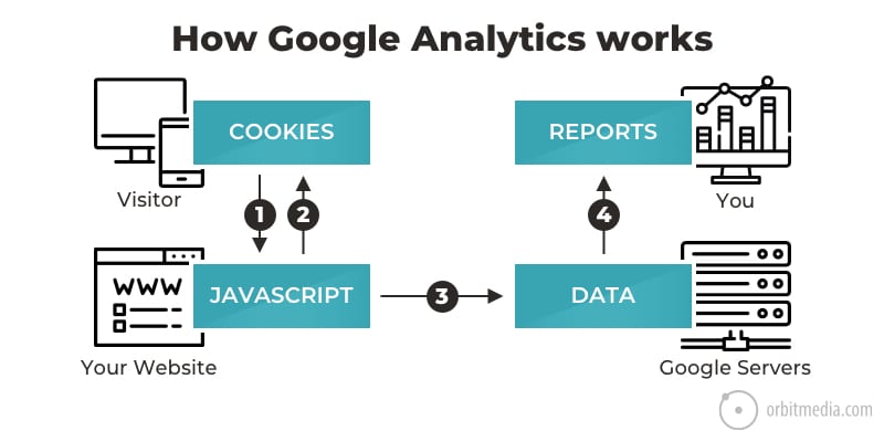
48. How Google Analytics works
It’s all about Javascript and cookies. Once you understand that, you understand the limits, the issues and a lot of the inaccuracies of Google Analytics. This little chart explains.
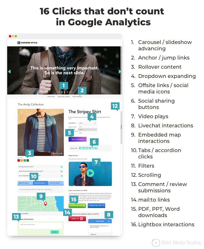
49. Clicks that don’t count in Google Analytics
By default, Google Analytics tracks pageviews. Page loads, Javascript fires, hit is recorded. But what about all of those non-pageview interactions? Like tabs and dropdowns? They aren’t recorded without a bit “Event tracking,” usually set up using Google Tag Manager.
Here’s a list of non-pageview interactions that aren’t typically recorded in Google Analytics.
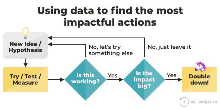
50. How to make marketing decisions using data
Reporting vs. analysis. There’s a big difference. Reports don’t affect your marketing. Only actions do.
So the best marketers use Analytics to find insights and test hypotheses. Analytics is a decision support tool, not just a set of pretty charts. If you aren’t using it to make decisions, you’re doing it wrong.
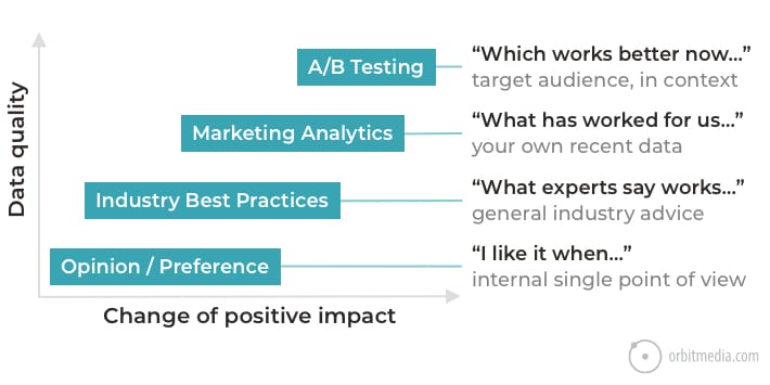
51. Sources (and quality) of marketing insights
Analytics isn’t the only source of insights.
- A/B Testing is the ideal source of truth, because it’s your visitors, in the context of your content and design. And time has been removed as a variable.
- Marketing analytics (including GA) is the next best option. It’s not a test, but it’s still showing the behavior of your visitors on your website.
- Industry best practices are useful if you have no data of your own. They can inform hypotheses but aren’t as likely to be effective as decisions made using your own data.
- Personal opinion is the riskiest. Definitely allow for inspiration, but make sure to use data to validate.
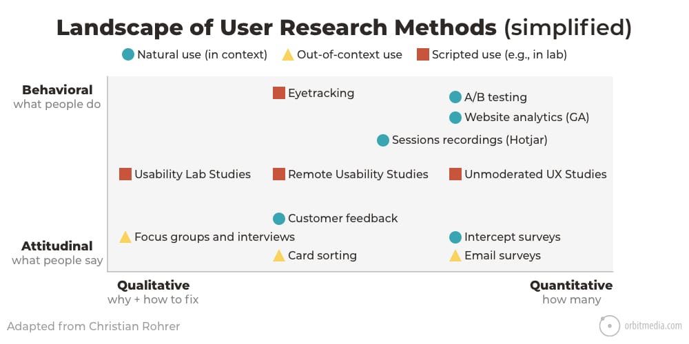
52. The 12 types of marketing research methods
There’s more to life than Google Analytics. It’s actually just one of many possible research methods. Here are a few examples:
- Interviews gather detailed qualitative data. Follow up questions can gather deep insights.
- Eye-tracking studies show where the eyes move, going far beyond clicking and scrolling.
- Surveys can include those who are non-users and non-customers to learn the needs of a potential audience.
Here is a chart of user research methods, showing a dozen of the options.
53. Average bounce rate of websites (by traffic source)
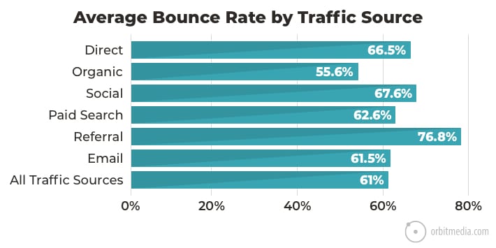
Ever wondered what a good bounce rate is? We looked at 500+ Google Analytics accounts and found the answer. The average bounce rate for websites is 61%
If you look closer at the traffic sources, you’ll see some variance. Organic traffic has the lowest average bounce rate. Referral traffic has the highest.
54. Average bounce rate of websites (by industry)
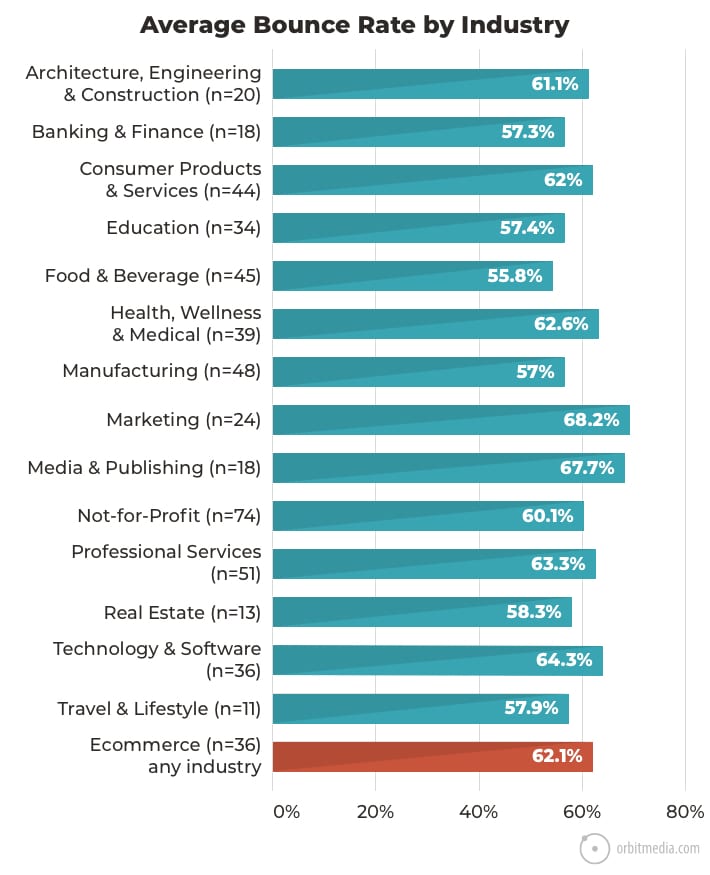
Bounce rates also vary across industries. Marketing and media are the highest.
This isn’t surprising since those sites often have articles and blogs. Visitors to articles often have very narrow intent. They came just to read that article. They’re less likely to visit other pages.
55. A data-driven content marketing audit
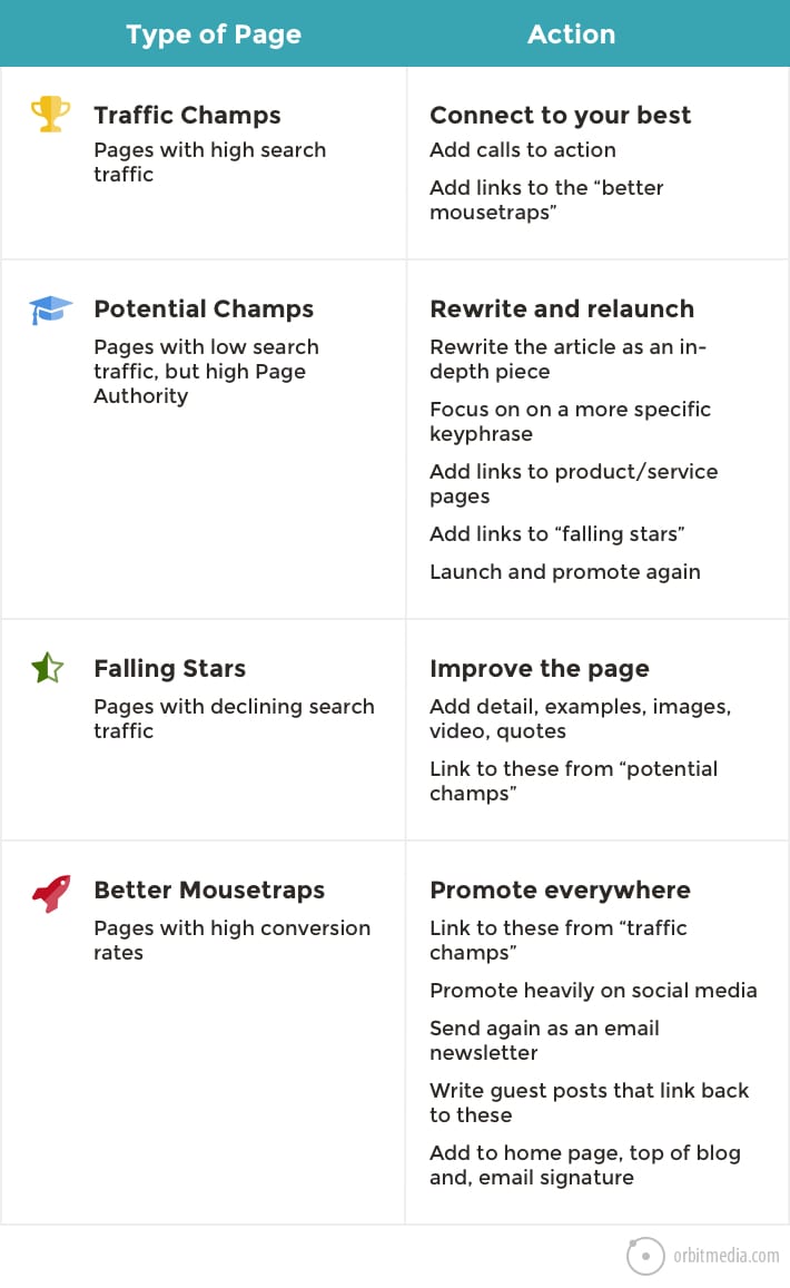
We’ll wrap up the section of Analytics diagrams with this one. It’s an example of how Analytics insights can be applied for better marketing outcomes.
Different pages have different opportunities. Those opportunities are all waiting to be discovered in every Analytics account. This chart is a summary of a content marketing audit framework, one that is powered by Analytics and focused on results.
The Power of Visuals
I love writing. So many marketers love writing. A lot of content marketers are trained journalists.
But we all have to admit, visuals are amazingly powerful. They have some big advantages over text.
- Images are more visually prominent than text on any page
- Visuals are processed up to 600x faster than text in the brain (source)
- Diagrams are uniquely able to simplify complex topics
This is why we include an original diagram in almost every article.
Article by Andy Crestodina of Orbit Media
