Avoid 12 biggest mistakes made during a website redesign!
Tháng 8 10, 2022
Lessons learned from many launches of websites (and counting).
A website lasts, on average, 2 years and 7 months. Meaning if you aren’t currently working on a website project, you probably will be shortly.
You are aware that you need a site that converts visitors into leads and builds or maintains the identity of your brand. And your guess is correct: Content is the key to achieving each of these objectives! It’s very typical for businesses to undervalue the “content” component of their websites, especially while undertaking development and overhaul tasks.
Because everything on the Internet is made up of content, including writing, photos, infographics, videos, e-books, white papers, case studies, forms, interactions, buttons, and even the actual web pages themselves. To ensure the success of your website, start thinking about your content now.
Here are the 12 most common content marketing mistakes we see in website projects:
1. Designing without regard to functionality and development
This might be the biggest mistake people make on their website. Getting this piece right means that your site is effective, not just beautiful. Launching an effective website means:
- It can rank in search and nudge your visitors toward desired actions.
- It allows for seamless functionality and data processing across platforms.
- You can edit and add pages, and manage your website post-launch, with the ease and flexibility you expect.
- Your site is mobile friendly.
Getting it wrong means none of that happens, and you have a lot of website rework ahead.
Your website must also be designed to bring in target audience traffic and convert potential customers. While brand marketers should have their say about visuals, user experience (UX) designers and developers should be as involved to partner on core functional aspects like:
- Information architecture and navigation
- Calls to action
- Content hierarchy
- Platform integrations and data storage expectations
- Back-end search and social attributes
On pages, let’s break down the individual elements of content. Depending on the content management system (CMS) your website is being built in, content elements within web pages may be called widgets, page blocks, blocks, containers, fragments, components, items, or something similar. What’s most important as a marketer is to be sure of two things:
(1) Blocks should be designed and developed with flexibility in mind. Think about the layout of information and how you want website visitors to interact with elements, or move from page to another, across various page and content types.
Instead of thinking about how you’d want something like a featured webinar (for example), to look, think, “when we feature any piece of content, we’ll want to include a heading, an image, teaser copy, and a way to click to that content.” Having those content guidelines will help the design and development team create a template that houses those elements seamlessly for all of your featured content.

This content block is promoting a webinar, but with a flexible design mentality, you’d want to use the same design to feature an ebook, case study, report, etc.
(2) Talk with your design and development teams about defining requirements for all page blocks. You’ll want to define requirements for both the author (the person updating the website) and the end-user (your site visitors). For example:
“As an author, if I associate this block with a URL …

… And I would like to be able to manually override everything but the link.”
And
“As a user, I need to understand what the featured content is about by seeing its title, a sentence or two about it, and an image. I then need to be able to click the button to get to the promoted asset.”
Lastly, you want a website with content that can be updated by non-technical people. That means you should limit the need for HTML and CSS knowledge, technical understanding, and photo-editing skills for regular, ongoing site updates.
2. Not checking and preserving existing page rankings
Even if your company isn’t focused on SEO, your site likely ranks—or is close to ranking—for some terms. Check what your website currently ranks for, and which pages are performing, and coordinate content and development teams to preserve those rankings — especially if the URLs will be changing.
How do you see what keywords your website is ranking for?
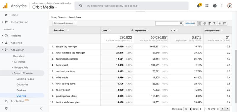
There are several ways to find this information, including Moz và SEMRush, and also for free using Google Search Console. If you have GSC connected with Google Analytics, you can find ranking keywords under Acquisition > Search Console > Queries. (If you don’t have these tools connected, find out how here.)
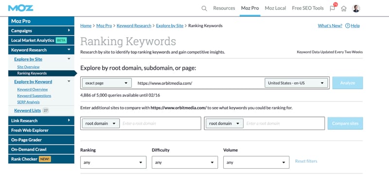
I use Moz’s Ranking Keywords report. All you do is put in your website’s URL, click “Analyze” and Moz spits out a report with every keyword your site ranks for—and the specific page that’s ranking for each term.
On your new site, you probably don’t want to remove or dramatically edit these pages.
Pro tip!
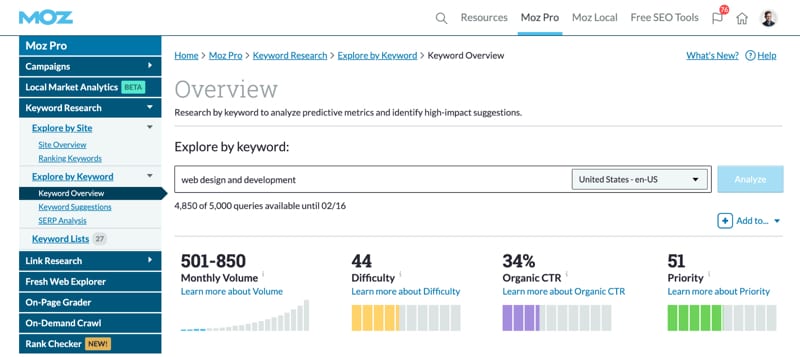
You can also use this as an opportunity to identify potential keywords for other pages. For that, you just drop down to “Keyword Suggestions,” put in your URL in again, and you’ll get a report with a ton of suggested terms that you can save in the system and/or export to a spreadsheet.
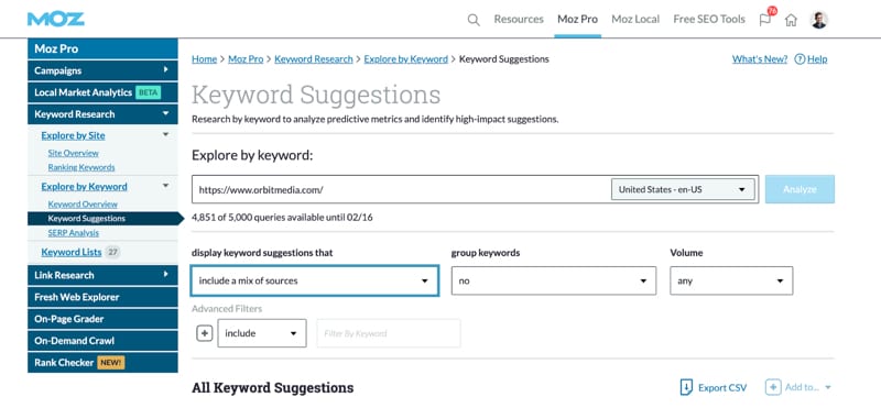
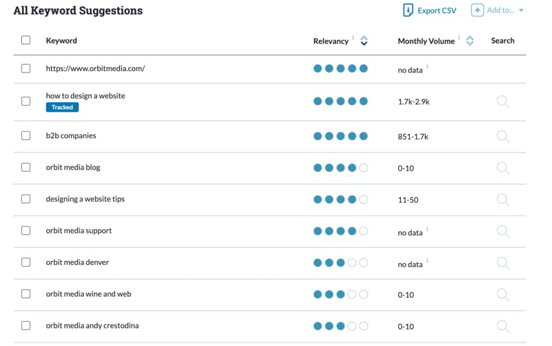
Enter a term you want to write a page about in “Explore by Keyword.” Moz shows the estimated search volume, difficulty, and competitive insights about it, as well as a list of similar terms to consider.
3. Not trashing underperforming content
Now that you know what terms and pages rank and what to preserve, what about everything else? A website redesign is a great opportunity to audit your website’s content and trim the fat.
Letting go of outdated, under-performing content does three great things:
- Leaves you with less content to have to replicate on the new site
- Gives you a cleaner, easier-to-manage content environment moving forward
- Provides only the highest quality content for your visitors
4. Working on design and copy separately
What comes first, copywriting or design? In my experience, this is the web world’s chicken-and-egg question.
Copy often needs to be a certain length for design, conversion and SEO purposes. Conversely, content needs will likely dictate page templates, page types and page block design tweaks. This is why your design and copy teams should collaborate closely.
Longform content tends to perform better in search. But modern design for core web pages favors short and punchy copy with lots of content blocks and visuals. It’s important to think about this when planning your content mix and appropriate layouts for types of pages your site will have.
Think about how different your content needs are for a simply designed page, like a blog post:
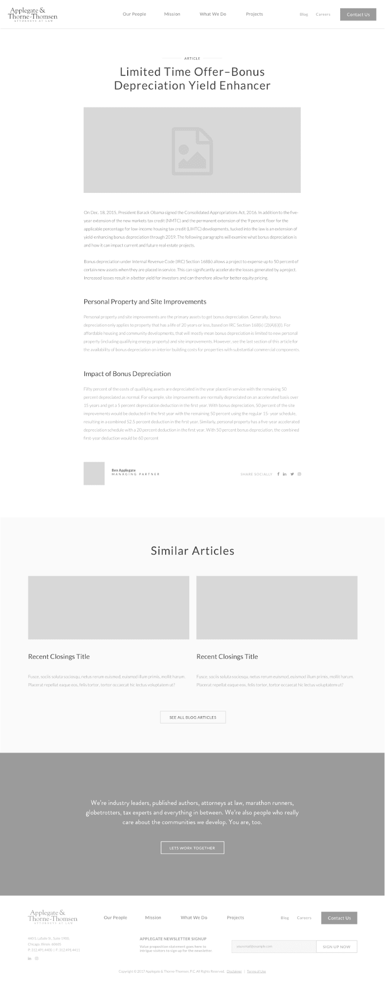
Compared to something like a product detail page with images, product information, related content and product recommendations, and need-to-know details:
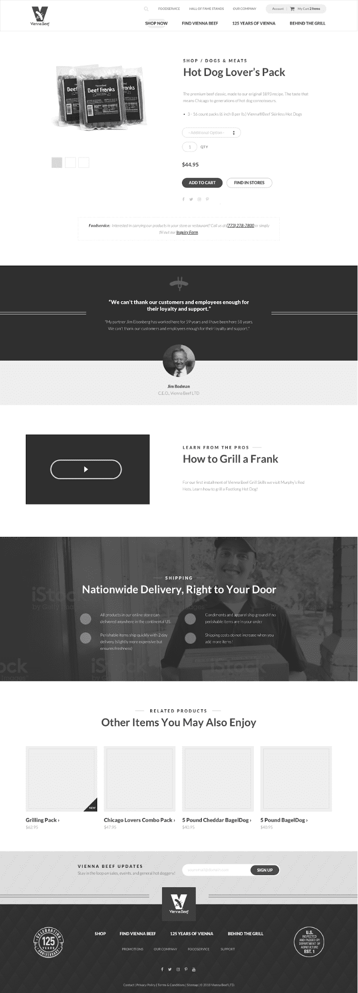
But don’t go overboard. Templates that are flexible and can be repurposed are your friends. Having too many content templates will make content management a bear once the website launches.
5. Underestimating stakeholder input, timelines, and revision rounds
New websites mean lots of eyes internally. People are passionate about their roles in the business and want to be involved. Your CMO or even CEO may need to approve some pages.
Not to mention, if you’re trying to write copy to rank in search, expect lots of messaging conversations with the service line, product and/or brand teams.
Content production for your new website is going to take serious collaboration. You need a strong leader, clear goals, and a solid internal project manager to coordinate it in order to adhere to your timeline and budget.
6. Ignoring metadata
Every page should have a title, meta description, etc. for search engine optimization (SEO) purposes. Though Google may not always use your page titles and meta descriptions verbatim in search results, that’s often what’s pulled through to validate to a searcher what they’ll find on a page. These SEO attributes not only help you rank in search for your target terms—they can also help convert a searcher to a site visitor.
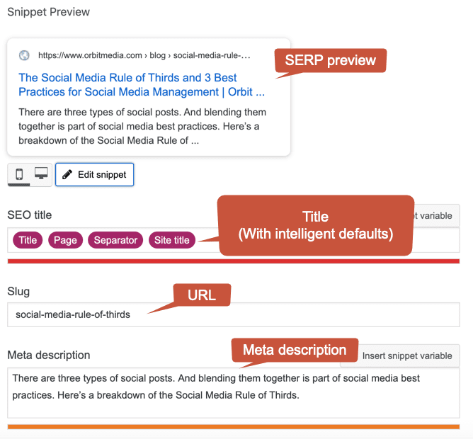
This is the back-end of a blog post in WordPress, where we’ve input the page title, URL, and meta description.

This is how that same blog post appears in Google search results.
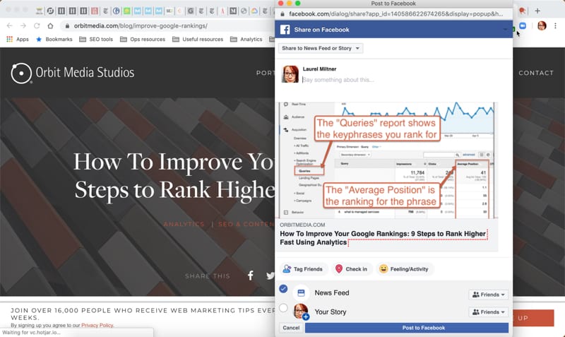
And don’t forget about social shares! If you’ve ever wondered where the image and descriptions for these come from, it’s called the open graph. Talk to your developers and make sure that open graph is installed across your website, and you know what the defaults will be set to—especially for social share images.
7. Letting images take a backseat
Images: You need a lot of them, sized appropriately, in multiple formats. And depending on design timelines, you may not know the details until later in the game. Start sourcing images early, and don’t lock yourself into a design with complicated image requirements.
Based on some of the decisions you made about metadata, see if your CMS can auto-size images from a single file for common use cases like page hero, teaser, and social shares. Also, talk with your development team about image size compression and content delivery networks, so your image-heavy pages don’t take forever to load.
Pro tips!
- If you don’t have photo editing skills in-house, design elements like transparent backgrounds or collages can be expensive to maintain going forward.
- Make sure team pictures are taken in a style that can be repeated as new employees join the company.
- Be thoughtful about iconography. It’s easy to get carried away with icons, but they can be hard to find. And you’ll probably need to be able to create new ones later.
8. Underestimating resources needed for content updates
Depending on the complexity of your site, standard pages will typically take anywhere from 15 minutes to several hours to create. Someone—or more likely several people—need to have the time to do this. If your site is particularly large and complex, a project manager dedicated specifically to content management can be a huge help.
Pro tip! Since you’re documenting all of your site content, use this as an opportunity to keep track of new (and old) content regularly. You’ll never have to do a massive content audit again.
9. Not having an internal process for content approval
Who “owns” the site, or elements within it? Is there content that needs to go up the ladder for approval? Before your website launch, you should clearly understand who needs to approve what, and by when. Plan for revision rounds, and be sure that anyone who needs to review content is aware of their deadlines in advance.
You might consider having several people responsible for various pages and site elements. For example:
- Content marketing person signs off on copy
- Brand person signs off on visuals and overall design
- Subject matter expert signs off on overall messaging and checks for factual errors
- Digital person confirms the page is complete and correct, based on its template and page type
Additionally, you might want to include a web development or technical person who signs off that the coding is correct and the content is still visible even after a user filters out explicit content off their device. This is especially important if your website caters to kids and teens.
“When creating content, you always think about your target audience. If your website has products for children, there’s a large portion of your audience that classify themselves as parents. Nowadays, it’s easy for children to get exposed to harmful content online. Parents invest in their children’s safety, so there are chances that they enable parental control apps on theirs and their kid’s devices.” Sean Clifford, CEO, Canopy
For high-profile or high-priority pages, you may need to plan for additional layers of approval. Example: It’s likely your CMO and CEO will want to give the homepage their stamps of approval.
Assign one person or committee that designates the priority of various types of content, website sections, and individual pages. Particularly at larger organizations, you’ll likely have multiple teams vying for prime navigation or homepage real estate.
You need a decision-making body to intake and assess these requests—and be empowered to make the final decisions for the whole of the company. Otherwise you could end up catering to the loudest voices, which can compromise your website’s user experience and ability to meet its goals.
Speaking of …
10. Not defining website goals and performance measurement plans
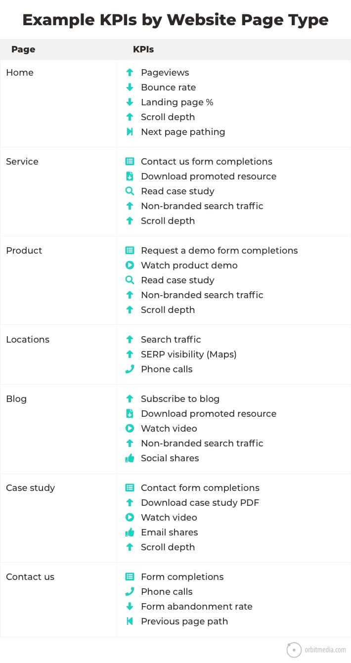
Determine what questions you want to know the answers to, how you’ll answer them, and how often those reports will be needed. Define your key performance indicators (KPIs), and put some numbers down that you want to achieve so you have something to work toward.
As Amanda mentioned, different pages and page types serve different purposes. A blanket measurement plan isn’t going to give you enough insight to truly know what’s working. I recommend creating goals and determining KPIs by site section, page type, and possibly even individual pages for high-potential performers.
Set up your analytics environment to capture the data that’s important for you to measure success—and to identify areas for improvement and testing post-launch.
Pro tips!
- If you’re already tracking your website’s performance, keep your existing analytics account as a benchmark, but give it a thorough review. Depending on its accuracy, you should be able to tweak the existing account or view. In cases where the data is incredibly messy or setup is incorrect, you may need to start from scratch with a new one. (Avoid this if possible for the cleanest year-on-year reporting.)
- If you’re not already tracking your website’s performance, set up a Google Analytics account as soon as you begin your website redesign project. This will give you at least a few months of benchmark data to compare to when your new website is live.
11. Not defining operations, ownership, and governance post-launch
You probably have a team dedicated to launch the new website. But what happens after launch?
If someone wants to change page copy, are they allowed? What if a team needs to create pages for a new line of business, and they want prominence in site navigation? Who writes the content, and who makes the call about where it lives in the site’s information architecture?
The time to define content ownership and governance for individual site sections and pages is before the new site goes live, or you’ll be living in operations hell until you figure it out.
Pro tip! Have a plan to take in website feedback post-launch, from messaging to functionality. I recommend one track for true bugs, and one for comments and suggestions. Have a plan (and team) to triage and respond to feedback, and expect a lot of it.
Consider things like:
- Have well-thought-out roles and permissions within your new website’s CMS, as well as documented internal processes for content updates. This can ease the burden of ongoing maintenance, and lessen the risk of errors or mistakes.
- What’s your process—both technical and operational—to respond to promises you make in website copy? For instance, if your contact page says someone will be in touch within 24 hours, make sure someone is. If visitors can sign up for a blog feed or newsletter, make sure you have the structure to deliver it.
12. Not having a post-launch plan for ongoing optimization
Building a new website can feel like running a marathon, but day one (OK, maybe day two) post launch should be the start of a next. How are you going to make your website work for you?
Website design and development projects are focused on getting a new and better site live while balancing analysis, speed, budget, and results. To meet those requirements, you probably launched a minimal viable product, and have a long—and thoughtful—“let’s do that next” list. But now you need a plan to tackle it.
In tandem with your website project should be an operational exploration. Do you have the right teams and team members to make this website the high-performing, dynamic business tool it was built to be? Consider how your needs for the following have changed, and either build the right internal structure or partner with an agency—or both—to meet your new digital marketing demands.
- Content creation: copywriting, images, interactive content
- Page editing and authoring
- Performance analysis and reporting
- Performance testing and iteration
- SEO (search engine optimization)
- CRO (conversion rate optimization)
- Digital, brand, content, and content marketing strategy
- Content management and operations
- Ongoing website design and development
The best websites leave room for improvement once they see real-world visitors and customer behavior. And one of the biggest content marketing mistakes you can make is to launch a new website and rarely touch it.
Digital ink is never dry. Users, markets, and businesses are constantly changing. Your website and web strategy need to continually adapt to stay competitive—and get ahead.
Put content first and you can avoid the biggest mistakes people make with their websites.
Article by Laurel Miltner of Orbit Media
